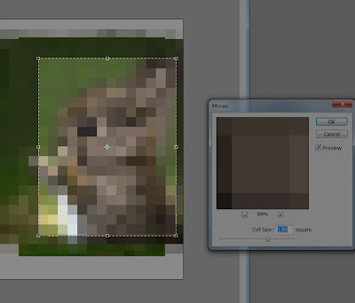
The greatest things about photoshop is that you can pixelate an image into squares of any size you choose. I have mentioned ixxi before and still have my version of Girl With a Pearl Earring to finish off for the hallway (but like everything else in my house still needs wall stripped of old wallpaper, replastered, sanded and painted.....hours of boring work).
There are also all sorts of programs I'm sure, for breaking down images into squares because that must be how they do it for cross stitch.... like KG Chart which apparently is free.
The main thing to remember when pixelating something is the scale. Say you are making a cot blanket - the dimensions are approx 110 x 130cm. So if you are making each square 10cm, you can only have 13 squares by 11 squares. It would need to be a very simple image. If you decide to go with 5cm squares, you have more to play with, but also twice the work. It would be better to go with 7.5 cm which would mean 105cm x 127.5cm quilt, with 14 squares by 17 squares (but you can adjust to 15 x 18 squares)
In Photoshop: go to Filter - Pixelate - Mosaic. You can adjust the pixel size. 130 is about the limit for an image - so you can just tell what it is meant to be. It is getting quite abstract though.
And then use the crop tool to crop the image to the number of squares the project will be.
 |
| This is about 14 x 18 squares I think. |
The simpler the image, and fewer colours, the easier it is. Easier is sometimes good, but not usually as interesting.
No comments:
Post a Comment